Heuristics for Supporting Cooperative Dashboard Design
IEEE Transactions on Visualization & Computer Graphics (Proc. IEEE VIS), 2024 DOI
Vidya Setlur
Tableau Research
Michael Correll
Tableau Research

Arvind Satyanarayan
MIT CSAIL
Melanie Tory
Northeastern University
Abstract
Dashboards are no longer mere static displays of metrics; through functionality such as interaction and storytelling, they have evolved to support analytic and communicative goals like monitoring and reporting. Existing dashboard design guidelines, however, are often unable to account for this expanded scope as they largely focus on best practices for visual design. In contrast, we frame dashboard design as facilitating an analytical conversation: a cooperative, interactive experience where a user may interact with, reason about, or freely query the underlying data. By drawing on established principles of conversational flow and communication, we define the concept of a cooperative dashboard as one that enables a fruitful and productive analytical conversation, and derive a set of 39 dashboard design heuristics to support effective analytical conversations. To assess the utility of this framing, we asked 52 computer science and engineering graduate students to apply our heuristics to critique and design dashboards as part of an ungraded, opt-in homework assignment. Feedback from participants demonstrates that our heuristics surface new reasons dashboards may fail, % that other guidance does not capture, and encourage a more fluid, supportive, and responsive style of dashboard design. Our approach suggests several compelling directions for future work, including dashboard authoring tools that better anticipate conversational turn-taking, repair, and refinement and extending cooperative principles to other analytical workflows.
Heuristics
Through an iterative process, we distilled 39 heuristics for analytical conversation organized into the five conversation states: initiation, grounding, turn-taking, repair & refinement, and close. A more detailed version of this table with the labeled categories and assigned Gricean Maxims is provided in supplementary material.
Initiation
H1: The dashboard supports specific analytical questions or tasks.
H2: The user should be able to explore the data using the dashboard.
H3: It is clear to the user where they need to start interacting with the dashboard.
H4: The charts in the dashboard support tasks that represent the overall intended goal to the user.
H5: There is a clear reading order within the dashboard and is it logical (e.g., top-down, bottom-up).
H6: The text in the dashboard is legible, easy to read, and useful. The different parts of the chart (e.g. titles, captions, or narration) are well-described.
H7: The charts in the dashboard clearly identify, compare, or summarize a particular aspect of the data.
H8: The layout, placement of charts, and the flow in the visualization should be easy to follow.
H9: The visual systems in place (e.g., a consistent font and color brand) provide guidance in understanding the analysis.
H10: There is a clear and consistent visual style for elements such as titles, axes, and colors.
H11: The conventions used in the dashboard such as icons are easy to understand for the user.
H12: There are consistent rules for the formatting of elements such as gridlines, borders, and supporting ink elements.
H13: The dashboard should disclose any biases. These can include the author’s personal biases, design biases, and/or biases in the data.
H14: The dashboard should communicate where the data came from, and what steps were taken to prepare the data.
Grounding
H15: Charts within the dashboard are at the appropriate level of detail to convey the intended message.
H16: There is a clear presentation of context, theme, and detail as part of the analytical exploration with the dashboard.
H17: The dashboard employs visual symbols and iconography to add meaning to the data being presented or help support the intended message.
H18: If there are icons and symbols in the dashboard, the semantics of their placement and appearance are helpful to communicate patterns in the data. (e.g., changing a plane icon’s location and direction for arrival vs. departure)
H19: The iconography supports or potentially replaces repetitive text directives.
H20: Concepts or metrics (e.g., date formats , time, currency, measurement) are either easily understandable or clearly defined in the dashboard.
H21: There is sufficient contextual information that describes what the dashboard is about.
H22: The charts within the dashboard make sense as an overall composition to help situate or contextualize the user.
H23: The text in the dashboard should emphasize the most salient points of what the visuals in the dashboard convey.
H24: The dashboard communicates a certain style or mood to the user.
Turn-Taking
H25: The dashboard is interactive and supports the user in completing a new analytical task or starting a new line of inquiry.
H26: Tasks in the dashboard should be achieved with minimal friction.
H27: When a user interacts with the dashboard, the dashboard should guide the user with their next step.
H28: The dashboard should update its view based on what is selected, highlighted or filtered by the user.
H29: There are text and visual elements to frame or guide salient information.
H30: There is a clear path and breadcrumbs for user actions within the dashboard.
H31: There are clear strategies employed in the dashboard to mark charts or marks more prominently than others to encourage a user to interact with them, as well as de-emphasize items not relevant to the conversation.
Repair & Refinement
H32: Functional dead end: The dashboard should not freeze, crash, display errors, or otherwise unexpectedly interrupt the user.
H33: Navigational dead end: The dashboard supports interactivity (e.g., filters, search) to help a user navigate between different snapshots of the data being presented.
H34: The dashboard should support input modalities (e.g., natural language interaction, filter widgets, and / or clicks) to answer any analytical question or task.
H35: The user can set or adjust their own definition of concepts or metrics, or otherwise include their own knowledge into the dashboard. (e.g., if a user is interested only in “tall” people, can they set their own definition of “tall”)
Close
H36: There should be a clear takeaway from the dashboard.
H37: The dashboard should not contain any information that distracts from the key takeaway.
H38: The conclusions match what the charts in the dashboard show.
H39: There is adequate evidence that the dashboard is truthful. The dashboard should be able to convince the key takeaway through credibility and trustworthiness (e.g. ethos appeal).
Bibtex
@article{2024-cooperative-dashboards,
  title = {{Heuristics for Supporting Cooperative Dashboard Design}},
  author = {Vidya Setlur AND Michael Correll AND Arvind Satyanarayan AND Melanie Tory},
  journal = {IEEE Transactions on Visualization \& Computer Graphics (Proc. IEEE VIS)},
  year = {2024},
  doi = {10.1109/TVCG.2023.3327158},
  url = {https://vis.csail.mit.edu/pubs/cooperative-dashboards}
}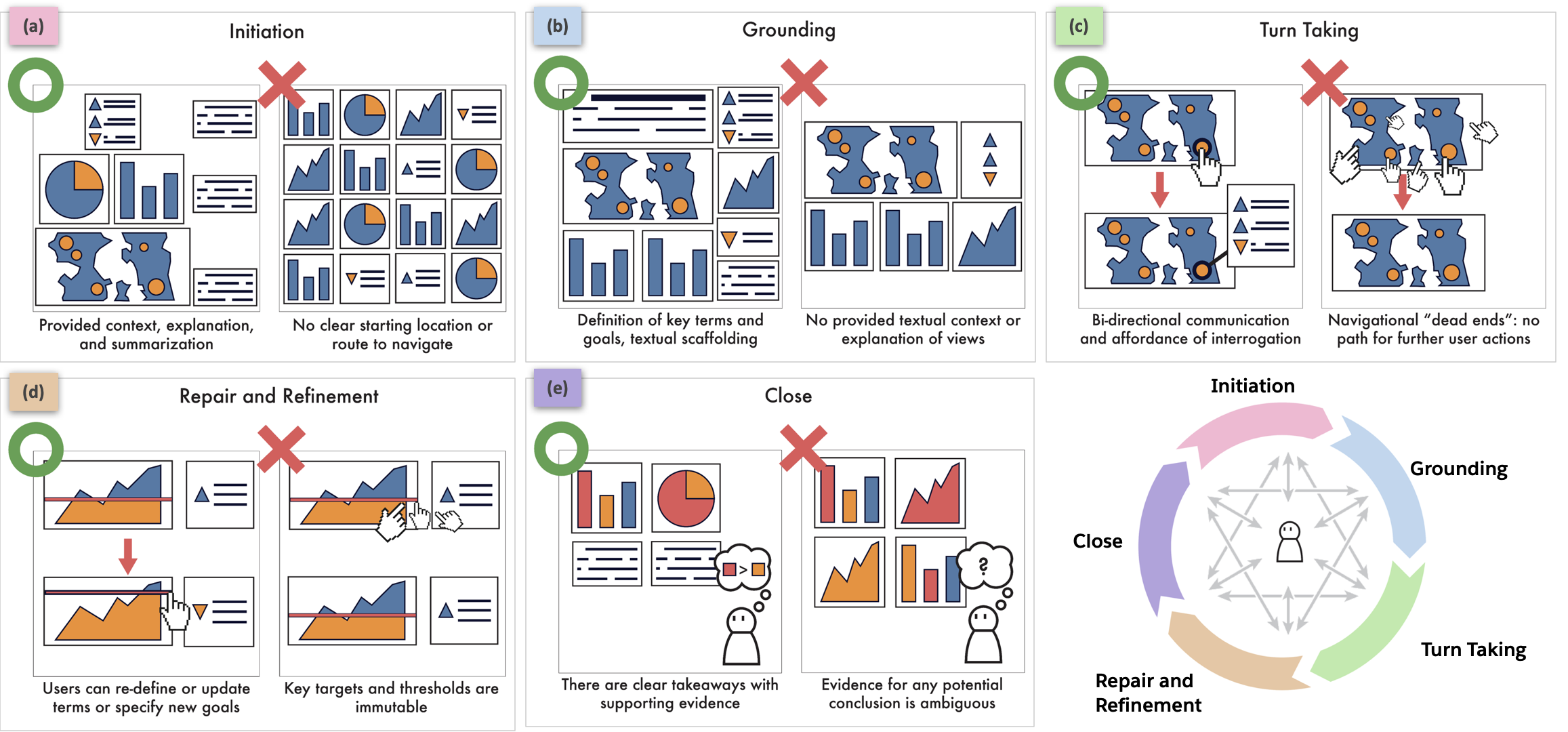
Successes and failures of _cooperative_ dashboard design throughout the five analytic states of a conversation (a-e). Cooperative dashboards guide users through their data and, in contrast to static dashboards, provide bi-directional communication through interactivity to allow the user to change or refine their analytical goals, switch between topics of interest and levels of detail, correct or update the system if it provides irrelevant or incorrect information, and provide useful summaries of analytical actions. Note that these conversation states are not necessarily sequential and the analyst can move between these various states.