Charting EDA: Characterizing Interactive Visualization Use in Computational Notebooks with a Mixed-Methods Formalism
IEEE Transactions on Visualization & Computer Graphics (Proc. IEEE VIS), 2025 DOI

Dylan Wootton
MIT CSAIL

Amy Fox
MIT CSAIL

Evan Peck
University of Colorado Boulder

Arvind Satyanarayan
MIT CSAIL
Abstract
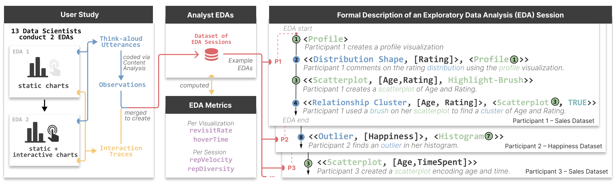
Interactive visualizations are powerful tools for Exploratory Data Analysis (EDA), but how do they affect the observations analysts make about their data? We conducted a qualitative experiment with 13 professional data scientists analyzing two datasets with Jupyter notebooks, collecting a rich dataset of interaction traces and think-aloud utterances. By qualitatively coding participant utterances, we introduce a formalism that describes EDA as a sequence of analysis states, where each state is comprised of either a representation an analyst constructs (e.g., the output of a data frame, an interactive visualization, etc.) or an observation the analyst makes (e.g., about missing data, the relationship between variables, etc.). By applying our formalism to our dataset, we identify that interactive visualizations, on average, lead to earlier and more complex insights about relationships between dataset attributes compared to static visualizations. Moreover, by calculating metrics such as revisit count and representational diversity, we uncover that some representations serve more as “planning aids” during EDA rather than tools strictly for hypothesis-answering. We show how these measures help identify other patterns of analysis behavior, such as the “80-20 rule”, where a small subset of representations drove the majority of observations. Based on these findings, we offer design guidelines for interactive exploratory analysis tooling and reflect on future directions for studying the role that visualizations play in EDA.
Bibtex
@article{2025-charting-eda,
  title = {{Charting EDA: Characterizing Interactive Visualization Use in Computational Notebooks with a Mixed-Methods Formalism}},
  author = {Dylan Wootton AND Amy Fox AND Evan Peck AND Arvind Satyanarayan},
  journal = {IEEE Transactions on Visualization \& Computer Graphics (Proc. IEEE VIS)},
  year = {2025},
  doi = {10.1109/TVCG.2024.3456217},
  url = {https://vis.csail.mit.edu/pubs/charting-eda}
}
Interactive visualizations are valuable tools in Exploratory Data Analysis (EDA), but their impact on how analysts interpret data is not well understood. Through a study with 13 professional data scientists using Jupyter notebooks, we observed that interactive visualizations lead to earlier and more intricate insights compared to static views. Our analysis highlights distinct patterns, like the "80-20 rule" in data observations, and provides design guidelines for crafting more effective interactive analysis tools.